

Every market era eventually reaches its inflection point — that moment when the Federal Reserve stops fighting inflation and begins worrying about growth. The “pivot,” as traders like to call it, is one of the most anticipated and misunderstood events in global finance. It rarely feels neat in real time: markets surge on hope, economists argue about timing, and the data always seem to tell two stories at once.
A Fed pivot is not a switch to prosperity; it is a signal that the balance of risk has changed. Across five decades of monetary cycles, from Paul Volcker’s disinflationary crusade to the liquidity waves of the 2020s, the months that follow a shift in U.S. policy have left a surprisingly consistent mark on markets. Understanding those patterns — and the psychology behind them — can help investors separate noise from signal as the next easing cycle unfolds.
What Exactly is a Fed Pivot?
In market language, a pivot means the transition from tightening to easing. Sometimes it begins quietly with a change in tone, as the Fed hints that “further hikes may not be appropriate.” Other times it arrives in crisis, with emergency cuts designed to restore liquidity. Either way, the first cut rarely comes as a surprise. By the time policy officially turns, investors have spent months pricing in the slowdown, the disinflation trend, and the next phase of risk appetite.
The U.S. has seen roughly eight meaningful pivots since the early 1980s. Each was shaped by its own backdrop — inflation waves, oil shocks, technology booms, credit bubbles — but the rhythm of market behavior rhymed more than it diverged. Equities tend to celebrate, bonds front-run the move, and gold quietly senses when real rates are about to fall.
Echoes from the Past
History doesn’t repeat, but it leaves a pattern. In 1984–86, the Fed’s shift from Paul Volcker’s extreme tightening to a more moderate stance unleashed one of the most powerful rallies of the decade. Yields fell steadily as inflation receded, credit spreads narrowed, and the S&P 500 began a multi-year climb.
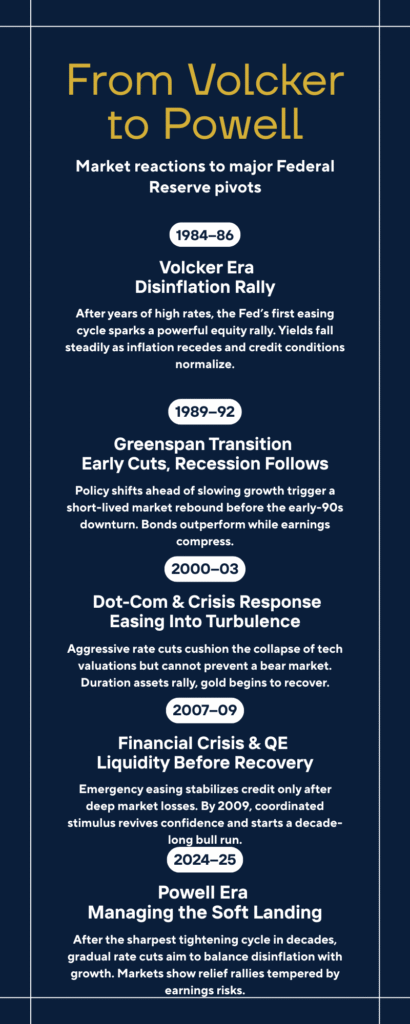
Five years later, the 1989–92 pivot looked different. Growth was already rolling over, and while equities initially bounced, earnings began to contract soon after. The yield curve steepened as short-term rates collapsed, but risk assets gave back much of their early optimism. Gold rose modestly, acting less as a speculative bet and more as a quiet hedge against policy confusion.
The early 2000s were harsher. The dot-com bust forced aggressive easing, yet stocks continued to slide. Valuations had expanded far beyond sustainable earnings, and cheaper money couldn’t repair that overnight. Bonds were the clear winner. The 10-year Treasury became the trade of the cycle, while credit spreads blew wider in the corporate sector. Gold began to find a footing — a signal that real yields were turning negative and faith in paper assets was wearing thin.
The 2007–09 crisis was the extreme version of that script. The Fed cut, markets crashed, and it wasn’t until policy coordination and fiscal rescue arrived that the next bull market could begin. The relief rallies between cuts were short-lived, driven by liquidity rather than conviction. Gold surged as a haven, and the dollar’s dominance, paradoxically, only deepened.
More recently, the 2019 “insurance cuts” offered a different lesson. With inflation subdued and growth merely wobbling, the Fed eased gently to calm markets. The S&P 500 climbed for months; small caps and credit spreads followed. It was one of the few genuine “soft landings” — a pivot without pain. But even that ended abruptly when an exogenous shock arrived in early 2020.
The Paradox in Data: Market Returns Six Months Post-Pivot
While the narratives dominate headlines, the hard data reveals a distinct rhythm of market behavior. The table below aggregates the total return for key assets six months following the Federal Reserve’s first rate cut in various cycles since 1984, showcasing the different risk dynamics at play:
| Pivot Date (First Cut) | Economic Context | S&P 500 (6-month change) | 10-Yr Treasury Yield (6-month change in bps) | Gold (6-month change) |
| Dec 1984 | Volcker Disinflation Ends | $+12.6\%$ | $-55$ bps | $-2.0\%$ |
| Jun 1989 | Soft Landing Attempt | $+2.9\%$ | $-110$ bps | $+5.1\%$ |
| Jan 2001 | Dot-Com Bubble Burst | $-12.1\%$ | $-40$ bps | $+15.5\%$ |
| Sep 2007 | Subprime Crisis Begins | $-11.5\%$ | $-100$ bps | $+20.2\%$ |
| Aug 2019 | Mid-Cycle Insurance Cuts | $+8.1\%$ | $-5$ bps | $+1.5\%$ |
🔍 A Crucial Distinction: Crisis vs. Insurance Cuts
The hard numbers underscore a critical lesson: the market’s reaction is entirely dependent on the reason for the pivot. When the Fed cut rates into a brewing crisis, such as the $-12.1\%$ S&P 500 slide in 2001 or the $-11.5\%$ drop in 2007, it was a signal of systemic risk, not relief. In these periods, investors flocked to absolute safety, explaining the $+15-20\%$ surge in Gold. Conversely, soft-landing attempts (1984, 2019) saw strong equity gains, with the market interpreting the move as a protective measure rather than a rescue mission. The greatest danger in the current environment is misreading a crisis-driven pivot for a soft-landing adjustment.
The Three Consistent Post-Pivot Market Patterns
Across these cycles, three tendencies stand out. Bonds almost always lead the turn, sniffing out the slowdown months before the first official cut. Equities rally early, then fragment as earnings gravity sets in. And gold, often ignored in expansion years, reawakens once real yields fall. The timing differs, but the sequence rarely changes.
Consider a snapshot of historical pivots. If you were to plot each one — from 1984 to 2025 — a clear rhythm emerges: optimism, retracement, and eventual stabilization once policy credibility is restored. The details vary, but the pattern speaks to human behavior as much as to macroeconomics.
Imagine this timeline as a living table: 1984’s gentle disinflation recovery, 1989’s false dawn, 2001’s dot-com exhaustion, 2008’s crisis, 2019’s calm adjustment, and the latest cycle, where inflation recedes but nerves remain raw. Each tells a story of expectations colliding with reality. That table, recreated as a visual, captures the paradox of the pivot: relief on the surface, uncertainty underneath.
Why the First Rate Cut is Rarely the Safest Time to Buy
Markets love the idea of easier money, but the first months after a pivot are rarely the safest time to buy. Lower rates may support valuations, yet the reason rates are falling — slower growth, weaker profits — eventually seeps into earnings. In the early phase, optimism dominates; in the middle phase, data catches up. The S&P 500 often gains in the six months after a first cut, only to wobble as corporate margins compress.
What determines whether that optimism lasts is credit. When bond markets remain open, spreads stable, and liquidity intact, easing can extend the cycle. When credit tightens — as it did in 2001 or 2008 — rate cuts cannot prevent a downturn. The Fed can change the price of money, but not its willingness to move.
The Intuitive Trade: Why Bonds Lead the Pivot
If equities are emotional, bonds are intuitive. They sense the turn before the rest of the market believes it. Two-year yields typically roll over well ahead of the first cut, flattening the curve long before the statement hits the wire. By the time the easing begins, duration holders are already in profit. The pattern has repeated so consistently that professional investors sometimes joke: “You don’t buy the first cut — you buy the rumor of it six months earlier.”
In post-pivot environments, the yield curve’s shape becomes a signal. A gradual steepening — short rates falling faster than long rates — usually means policy is easing into stabilization. A violent steepening often hints at distress: growth expectations collapsing faster than policymakers intended. Reading that nuance separates portfolio resilience from chasing the wrong rally.
How Gold, Real Rates, and the Dollar React to the Pivot
Gold’s relationship with the Fed is subtler than many assume. It’s not inflation per se that drives it, but real yields — the return investors can earn above inflation. When policy pivots lower and real yields drop, gold becomes relatively more attractive. That dynamic has persisted through every cycle since the 1980s. It also explains why gold and the U.S. dollar can rise together: both serve as hedges against uncertainty, though for different reasons.
In recent years, that safe-haven behavior has found new digital expressions. Crypto assets like Bitcoin often mirror the psychology of gold — speculative in boom times, defensive when liquidity shifts. The mechanisms differ, but the instinct is the same: a search for refuge in an uncertain monetary environment.
The Psychological Pivot
The modern market doesn’t wait for the Federal Open Market Committee to act; it trades the tone. A dovish sentence in a press conference or an unexpectedly soft inflation print can unleash weeks of repositioning. Central-bank communication has become a policy tool of its own, shaping financial conditions before any decision appears in the data. That means by the time the Fed actually cuts, much of the easing has already been priced in.
This feedback loop is both stabilizing and dangerous. It allows the Fed to calm markets without immediate action, but it also pulls forward returns — and volatility. When expectations race ahead of reality, even a measured statement can trigger violent repricing. The 2025 environment, heavy with algorithmic trading and social-media speculation, amplifies that sensitivity. Words now move trillions.
What Really Matters After the Turn
After the first cut, the data begin to matter again. Inflation’s trajectory, earnings revisions, and credit spreads will define whether the pivot marks a soft landing or a slide into contraction. Historically, four indicators capture that tension: the yield curve, the behavior of corporate spreads, the direction of profit forecasts, and the breadth of equity participation. Together, they tell whether the rally is broad-based or merely technical.
So far, the 2025 setup resembles the mid-1990s more than the early 2000s — inflation easing, employment softening but not collapsing, and credit markets still functioning. But the difference lies in noise. Today’s market is faster, more crowded, and more reactive. Information itself has become a form of leverage.
Why History Still Matters
Economic textbooks often present policy cycles as sequences of inputs and outputs: hike, pause, cut, recover. Reality is less mechanical. The lag between monetary policy and market psychology can stretch for months. In past cycles, it was enough to study balance sheets and yields; today, understanding sentiment and narrative velocity is just as important.
The lesson from history is humility. Even when patterns hold, timing rarely does. In 1989, traders thought they were witnessing a soft landing; recession arrived within a year. In 2019, few saw a pandemic coming. Yet through all of it, one truth endures: liquidity fixes liquidity problems, but not solvency ones. The Fed can buy time — it cannot manufacture confidence.
The Uniqueness of the Current Pivot (2025)
This year’s shift is different mostly in perception. Inflation has fallen faster than expected, yet growth remains uneven. The Fed has softened its tone, but real policy easing is gradual. Markets, impatient as ever, have already priced a full year of cuts. That optimism may prove justified, but it leaves little margin for disappointment.
The 2025 setup, while resembling the gentle easing of 2019 on the surface, carries unique structural baggage that cautions against outright optimism. Unlike 2019, the current environment is marked by structurally sticky inflation—driven by geopolitical fragmentation, supply chain re-shoring, and high domestic labor costs—making the Fed’s long-term path to 2% highly uncertain. Crucially, the system is burdened by a mountain of corporate debt that must be refinanced at much higher rates over the next 24-36 months. While credit spreads remain tight for now, this ‘debt rollover risk’ introduces a solvency pressure that was absent in prior soft landings and cannot be fixed by monetary policy alone. Furthermore, the massive capital investments spurred by AI and energy transition are driving structural demand for funding, which may naturally keep long-term yields elevated regardless of short-term Fed action. This means the market must contend with a difficult reality: the cost of money is not returning to pre-pandemic levels, forcing a painful reckoning for interest-sensitive sectors like housing and highly leveraged small caps.
If the 2025 pivot follows the historical script, bonds should outperform early, equities should rally selectively, and gold will test new highs as real yields sink. But the outcome will hinge on one question: can the Fed lower rates without undermining faith in its own credibility? That’s what separates a clean pivot from a crisis-induced one.
The Takeaway: From Relief to Resilience
A Fed pivot is not a finish line; it’s a change of weather. The storm may pass, or it may reveal what was fragile all along. For investors, the challenge is to avoid treating relief as recovery.
Bonds tend to do the quiet work first. Equities follow if earnings can. Gold, patient as ever, waits for confirmation that the world still believes in paper promises.
Actionable Investment Strategy
For investors navigating the current environment, the lesson is one of selective exposure. The historical data confirms that you do not buy the first cut indiscriminately.
- Fixed Income and Gold: Given the structurally sticky inflation and the systemic corporate debt rollover risks you’ve highlighted in this cycle, overweighting quality bonds and gold provides a necessary defensive anchor.
- Equities: Any rotation into equities should focus on businesses with strong balance sheets, high free cash flow, and reliable pricing power. Steer clear of highly leveraged small-cap stocks and interest-sensitive sectors (like regional banks and non-utility real estate) until the yield curve normalizes.
The pivot can buy time—it cannot manufacture confidence. The next few months will tell whether this era becomes another soft-landing footnote or the start of a new cycle of volatility. Either way, history’s message is clear: when policy pivots, patience and careful selection usually pay best.
For a deeper view of how policy tone shapes markets before action, revisit our feature on the Fed’s dovish turn. For raw historical context, the Federal Reserve’s FRED data and the NBER recession chronology remain the cleanest sources for verifying each cycle’s timeline.
The next few months will tell whether this era becomes another soft-landing footnote or the start of a new cycle of volatility. Either way, history’s message is clear: when policy pivots, patience — not panic — usually pays best.
This article is for informational and educational purposes only. It does not constitute financial, investment, or legal advice.
All economic and financial policy discussions are presented for scenario analysis and illustration only. Investing involves high risk, and you may lose capital.
Always conduct your own independent research and consult a qualified professional before making any financial decisions.